This is the second question of the media analysis/evaluation, presented on slideshare:
Wednesday 7 May 2014
Thursday 10 April 2014
Evaluative Analysis
1. In what ways does your media product use, develop or challenge the forms and conventions of real media products?
Main Product- Music Video

Ancillary Text 1- Digipak

Ancillary Text 2- Magazine Advert


For my A2 media coursework product, we produced a music video rendition of 'Human' by The Killers. The video uses, but also challenges the conventions of real media products of the same genre; indie/alternative music video.
I, and the rest of the group, produced the storyboards with the knowledge of a convention of music videos; three separate narratives, which mainly consist of two different stories that eventually connect, and then another narrative with the artist or the band performing. I storyboarded three narratives that correspond with that certain ideology of conventional music videos, incorporating two separate stories, one involving a man, and one a woman, who are both presented as visibly depressed due to their average human qualities. The video proceeds with these characters eventually becoming more optimistic and spontaneous; becoming the dancer. I annotated the lyrics beforehand and noticed certain lyrics that influenced my interpretation of the song meaning, in particular the line 'are we human... or are we dancer?' And 'pay my respects to grace and virtue' also, because it questions how we take advantage of our individual qualities, then paying respect to them as we become less worrying and much more optimistic and spontaneous. The two characters I have used in these two narratives both represent two different unusual factors: The woman becoming less concerned about the average and disadvantageous features of being human, instead opening herself up to the world and doing whatever she pleases because it's her prerogative; and the man representing curiosity as he follows the music of the band (third narrative), not concerned with anything else, just following his curiosity, doing what he wants. This is what connects these two characters; they aren't conforming to the conventions of being human, which is my main intention from how I interpreted the lyrics. Finally, these two characters journey towards the source of the band performing, which is the third narrative, where everything and everyone in the video come together. From this certain convention, I've learned how to follow and apply the idea of multiple narratives, able to film these narratives separately and then piece them together via iMovie, constructing the music video out of a story driven by metaphors and some literal visualisations. The problems that I could improve on are the visual interpretations of the lyrics; making the connection between the two characters more clearer for the spectator, possibly filming a scene where they both perform the exact same action.
I followed Andrew Goodwin's theory on music video types: illustration, amplification and disjuncture. One or two of these categories are used in many conventional music videos, like The Asteroids Galaxy Tour's 'Heart Attack' (disjuncture) or Adele's 'Chasing Pavements' (illustration & amplification).If I could improve on the video in accordance to Goodwin's theory, I would focus on only one category instead of multiple ones, because I feel that doing this may have driven the video to be quite obscure in places.
2. How effective is the combination of your main product and ancillary texts?
Main Product- Music Video
Ancillary Text 1- Digipak
Ancillary Text 2- Magazine Advert
I feel that the combination of our main product and my 2 ancillary products are much more effective than the actual video, and also very effective as a whole. The metaphors, locations and the cast used in the video all connect to one or two of the ancillary products, such as the main feature involving the reoccurring tree background that the band perform around which is present on three separate images on the digipak artwork (ancillary text 1). The location of the band performing is also the same location in which I took the photo of Josh Hobson (one of the band mates), yet the positioning is to the far right of the tree from the video, and my intention between these three products, location-wise, was to follow certain criteria: shoot outside and have a wide open space for the background. This I believe is quite effective because of the indirect connection (regarding location) between the three products, and made further effective because not every image was planned, but improvised (see ancillary text 2). I also thought the spontaneity from the improvisation was effective because it paralleled the intended visualisation of the lyrics (being of average human qualities, and then transitioning into a more spontaneous character, like a dancer), which then influenced the shots of the instruments in the tree on the digipak artwork, as well as ancillary text 2's improvised flagging gesture as influenced by one of the band members walking up to the camera and forming a gesture reminiscent of the film Kes (which is what then influenced me to name one of the pseudo-songs in the digipak tracklist). Another connection between the video and any of the ancillary texts, besides location, are lyrics and metaphors. The lyrics 'pay my respects to grace and virtue' were included along with the image of a rusted footpath sign that metaphorically implies the line 'are we human, or are we dancer' (although not originally intended) because of the deeper implication that people are making their own path, as shown with the rust. I believe that the deeper meaning of that image also contributes to the overall effectiveness of the combination because of the chorus lyrics in the video and then one single image representing that narrative along with another line of lyrics.
Altogether, I believe the indie/alternative genre of the video fits perfectly well with the sepia tone of the ancillary texts, due to the fact that the colours are simple, as is the palette for the music video because it's the indie/alternative genre, where the features are much more 'structured' and not all over the place. The intended odd nature of the video, with the spontaneous actions of the characters to reinforce the difference between human qualities and that of a dancer's, combines very effectively with the images in the ancillary texts. I intended to wipe out the eyes of every person in each image because I wanted to present the superficial fact that music isn't media for the eyes, but for the ears.
The music video promotes the ancillary texts, and vice versa. Our music video promotes my album Days Out In Sepia by The Project (fictional cover band name), and then the magazine advertisement promotes the album and the video, with features I added that made the advert seem much more authentic, such as reviews from music magazines, social networking links, a website address dedicated to the album, a QR code and also a screenshot of the album with details on its release, as I knew that every music promotion details the release date. The inclusion of an actual QR code that links to the music video on my YouTube channel is a completely new and very useful feature I have used, making the ancillary text seem as close to genuine as possible, which I am very pleased with.
These three items combine very effectively through their contributions to one another, their connections in terms of what's in the video and what's on the ancillary texts, their simple yet attractive colour schemes, and the idea that they're ordered correctly in terms of the promotion; the video/single being released first as a taster, then the announcement of the album details, and then the further promotion of the album through a different media text. They all combine to create one big promotion of the same product, which is again very effective because it's multi-purposed. There aren't any improvements I would make to these ancillary products, because they correctly represent the factors discussed in the indie/alternative genre.
3. What have you learned from your audience feedback?
From the feedback I was given from various audiences, the overall 'score' of the music video was fairly average, the overall score for the album art was fairly positive, and the magazine advert was very positive.
For the music video, the most prominent and frequently discussed problem was the synchronization of the miming and the background music, 'especially at the end.'
This is the main problem regarding the video that I would consider for improvement, as well as learning from this particular feedback that synchronization is one of the largest factors of how smoothly and well-edited music videos have to be.
I have learnt from the 'does it match the intended genre' question that audience views are dynamic and their views on the indie genre differ.
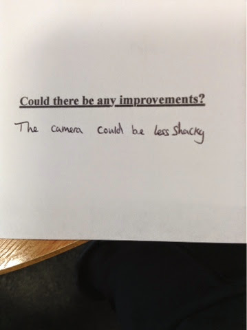
Based on the above image, and because it's likely to be similar to other answers if more people were asked, I would improve on the representation of the symbolism, as I myself seemed to be confused on how I represented such allegory, like the transition between mood is only shown by the attitudes of the characters, yet the intention of the symbolism isn't reinforced by any literal representations, like I could've used sticky labels that the characters mysteriously have (I did shoot these scenes, but time was running short to edit them in), with the words 'human' and 'dancer' between two separate labels.
Finally, I have learnt from the improvements section of the questionnaire that audience's expectations differ as mentioned before, but these improvements are ones that could be applied quite easily.
For the ancillary texts, because they're both the same in tone, font and image-wise, I will be viewing the reviews for both products.
There has been a review regarding the presentation of the products, with the font and editing ("Better font and better editing needed") requested to be improved on, because the products, particularly the digipak album font, need to be clearer and more readable, which I understand fully because of the Braggadocio style font being block-styled letters may be unreadable to certain audiences. So to improve, I would change the font to another which has more spaced out letters and a different colour to make them prominent on the sepia backgrounds.
What I've learned from the audience feedback for the ancillary products is that they're more praised than the video, but it depends on who views them and how they review them. I've learnt that the ancillary products do adhere to the indie genre as well as the video.
4. How did you use new media technologies in the construction and research, planning and evaluation stages?
In the construction/research stage of the production, I used media technologies, but only certain technology that was new to me. Because it's the research stage, I researched 5 music videos of the indie genre and analysed them, with the media technology used being YouTube to view the videos and the blog to analyse them. I printed out the lyrics to Human and annotated them to generate an interpretation on what the semantics of them are.
Slideshare was a new media platform that I used, researching Andrew Goodwin's theory on music video categorisation, to gain knowledge on spotting differences between other videos and also applying categories to our music video.


I also produced a music video presentation on Slideshare where I mentioned certain features of The Killers' music video, but upon viewing it the second time, I feel that the PowerPoint is much too short and not exactly interesting information-wise. If I could improve on it, I would follow the areas I mentioned that I said I would cover, therefore making the presentation longer and much more interesting.
Another new technology, or platform, I used was a collage generator called Photovisi, where I drew knowledge from various indie music videos and presented the typical features of them, with focus on location, costume, regionality, subliminal messages ans surreal imagery. However, because the presentation is more image-focused than information-focused, I only noted these typical features and presented them as captions to the photos, yet I know that what I was intending was still clear, and the only improvement I could've made was to add a little more information to provide as clarification of what my intention for the collage was, despite the title 'What are the typical features of an indie music video?'
For the planning stage, one of the new media technologies I were introduced to, for media studies in general, was YouTube, as we had not previously used the website before A2 to actually showcase our work, only linking our blogs with research information to YouTube and other sites. The main planning that was shared on my YouTube account was the storyboard drawing, which I presented and edited in accordance to the procession of lyrics, of which I used iMovie, an application used before for AS' 'Curiosity,' to create.
Another new media technology used was green screen, which we planned to apply for certain forest scenes, but the filming of forestry and the subsequent pasting of the image into the video proved useless due to the incorrect mix of colour. If I could improve on this, I would instead film a different background with better lighting so that there would be a lesser chance of a mistake.
I (and the rest of the group) was introduced, during planning and before filming, to HD Camcorders with SD Cards, replacing the DV tapes used in AS. I believe this new technology put us more to an advantage time-wise, but considering there were problems concerning the mix-up of memory cards and taking longer than anticipated to find them, a problem which I ended up solving by simply dotting our memory card with a marker. I was also introduced to a Gear-Pro camera which provided us with the liberty of incorporating sweeping and unbroken shots at whatever angles, with a particular example present in the finished video where the camera smoothly passes by the band. The introduction of new equipment called telescopes were the handles that attached to the Gear-Pros, helping us with whatever positioned we wanted the frame in.
For the evaluation stage, there wasn't any particular media technology that I hadn't used before for the evaluation. I evaluated the video through iMovie, using the sound waves to make sure it was synchronised; using YouTube to share the video for some possible audience feedback, and then using Blogger to analyse the video.
Ancillary Texts
For the construction and research of the digipak artwork, I searched images of genre-specific album art from different artists of the indie/alternative genre to give me ideas on recognising prominent and typical features of them, such as one specific tone of colour and a wide open background is what I noticed is applied to various album art. These helped in the sketches of my intended artwork, mostly sketching images that I had shot previously, using a DSLR camera for a range of them, which was a new media technology for me, as we hadn't used one in previous AS media studies.
The planning of the album art consisted vastly of sketching and taking photos with DSLR's, then analysing them on Blogger, giving reasons why I wanted to incorporate certain images into the artwork. iPhoto was a media technology new to me that was used for the planning stages, using it to edit the chosen images into the finished product evident in the screenshot of the six-sided digipak album art.
For the magazine advert, the same media platforms were used (Blogger, iPhoto, DSLR cameras) throughout the research, planning and evaluation stages. Here, the only improvement I would've done was to change the colour of the QR code to an orange tone, so that the magazine ad could be described by one simple tone, as many indie albums and promotions do.
What did I find wrong with the production (Music Video)?
There was a certain problem throughout the production that decreased the time we had and the motivation to improve on the music video; the departure of three cast members (two actors, and the band's lead singer), which warranted replacements for the actors, but the band member had already shot many scenes, so I decided to carry on filming without the lead singer, focusing on other band members instead for the rest of the video.
Monday 7 April 2014
MUSIC VIDEO
Here is the 'Human' music video by The Killers that we filmed.
I NEED FEEDBACK ON THIS VIDEO, IT WOULD BE MUCH APPRECIATED AND ALSO BE REALLY HONEST! CRITICISM IS ACCEPTED!
What was good about it?
What was bad about it?
Does the video meet the desired genre (indie/alternative)?
Does the video meet the desired genre (indie/alternative)?
What improvements do you suggest I should make?
Give it an honest rating out of 10!
Enjoy! Or don't...
Wednesday 2 April 2014
MAGAZINE AD- Procession
Here are the chosen magazine ads for our fictitious band The Project and the release of the album Days Out in Sepia. There are more than one example, where different changes will progressively be made.

After the sketches, I looked again through the images we took, and eventually I came across the edited version of the Kes-sequel image of one of the band mates, Josh Hobson. The symmetry of the image attracted me greatly and it was further emphasised with the connection to the album cover; eyeless band mates, with the intention to declare music as a feast for the ears, not for the eyes. Also, Josh's eyeless face is an attempt to attract the consumer as well as express the message intended for it.
The Braggadocio font was applied to the main title on the magazine, linking to the same font of the album, and using the large 72 size font to attract consumers.
The reviews used here are of course fake, but I wrote one review as though it's from NME, and one that was from a made up magazine. The inclusion of NME was intended to express the popularity of the album,bit being positively reviewed by a well-known music magazine.
I inserted a screenshot of the album cover on the advert, with a release date (my birthday) and suggested options of how to buy the album: technologically (MP3) or physically (actual album). The intention of this was to show how similar in tone to the magazine the album is so that consumers can identify with the advert when they come across the album.

Here, the added features are the social networking links with the intention of following the technological conventions of advertisements; sharing through prestigious social networking sites like Facebook and Twitter.

Here, like the album screenshot; I've formatted the social networking icons with borders the same colour as the majority of the advert; orange. I've also included a QR code (fake) that, if I had enough time, i could use a code that takes you to the actual music video we made. It was intended to cover the empty space beside Josh's face, but also to adhere to the technological conventions of the modern day, like the social networking icons do.

Here, like the 'Pre-Order Album' notice below the album screenshot, I changed the colour of the words in the reviews to make them stand out more. Also, I decided to avoid changing the colour of the reviewers (NME & Listen Up) so that they could also stand out below the different, more peachy colour of the quotes.

This being the final example, and the one I intend to really use as an advertisement, I added a fictional website address. It's titled 'http://www.projectsepia.co.uk' in a light green font to stand out with its colour among the advertisement, despite its small size. The use of the words 'Project' and 'Sepia' in the address were derived from the album title 'Days Out in Sepia' and the band title 'The Project.'
Like the QR code, I may consider turning the address into an actual link that takes you to my blog, if possible.
Thanks for reading!
Monday 31 March 2014
Magazine Ad Artwork Sketches
These are the three potential sketches for the artwork that will accompany the magazine advert for our fictional band The Project. These examples may not be used at all and a different background may be used as other ideas may be considered between this post and the final artwork post.


This sketch is of a bridge that was previously one of the potential images for the digi-pack artwork. I used the same font for both the artist title and the album title so that there's the idea of simplicity in the picture, as well as the symmetry intended with the use of the bridge and the trees at either side of it.
I included the 'Pre-Order Now' sentence below the large font of Days Out In Sepia so that when consumers first see the large font, they see the imperative rhetoric below it; encouraging them to pre-order the product.
The reviews were purposely positioned to be part of the symmetrical image I had intended. Because they are placed on the floor of the bridge, the single colour of the bridge would help make the reviews more prominent. But the main reason I included reviews was to generate fame and a positive feedback from big music companies, so that their reviews are reliable and therefore attract the consumer; possibly encouraging them to pre-order the product.
I used the tree image again from the digi-pack because it's a simple image, yet it expresses an oddness about it due to the guitar being placed in the center of the tree's branches. The image was taken from the improvised scene at the end of filming Human where the drummer put his and the guitarist's instruments in the tree.
The reviews again were placed at either side of the tree with the intention of presenting the image symmetrically. The idea of symmetry was applied because it juxtaposes with the eccentricity of the guitar and the album artwork, so it could garner a possible attraction from certain consumers. And again, a famous music company 'reviewed' the product, so it gains fame and attraction.
The fonts for the artist title and the album title were changed and made different to each other because from looking at various indie albums, their artist and title fonts are different, like our digi-pack has. The reason for making the fonts different to them of the digi-pack was because I wanted to make the fonts look different in each ancillary product.
This image is of the 'Lunar Park' fair, with the badly drawn Ferris wheel replacing the tree as the divider of the page; creating symmetry. The original image was used for the back cover of the digi-pack, which I intended to have because it connected visually to the album art. Also, like the other two sketches; the image represents going out, or a day out which is intended to connect with the album title Days Out In Sepia.
With the fonts, I again changed the so that they would match because the idea of simplicity again became apparent, but I believe the final artwork will have the fonts different to each other again because of the traditional use of them on artwork.
The reviews this time are on the same side, now opposing the 'Pre-Order' box; setting out the design a little more clearly than before, despite the lack of symmetry between them. As always; one of the reviews is from a famous music magazine/company to generate recognition through the positive feedback.
Finally, the 'Pre-Order'box now includes the date for the release; my birthday. Like the first sketch; it refers to Human by declaring that it's a single able to be pre-ordered along with the album, so a connection is present. This is the most interesting of the sketches in my opinion because it represents a more fun side to the album, which is 'present' in the song Lunar Park; the image.
Tuesday 25 March 2014
ARTWORK
The image is rather bad quality, most probably due to the screen-shotting. But here's the artwork in all its 6-sided glory!

For the front cover, I decided to stick with a simple image of two band members standing on either side of the tree from the music video we made. The overall tone is sepia, with the intention to make the whole artwork seem old or vintage. However, the deletion of the eyes of every band member on this digi-pack was intended to imply that music isn't a feast for the eyes, but for the ears, emanating from the mouth and the instruments. This is why I shot a photo of the guitar in the tree; to direct the consumer's attention to the instrument's odd positioning to emphasise this message; It's not visual material, it's audio material. It's supposed to generate a feeling of confusion because it looks so eccentric in a normal background.
I named the band The Project because that's what the whole media coursework is; a project. It's a monosyllabic title, like The Killers, because the band doesn't need a creative name if the music is the creative factor of the coursework as well as the artwork and the rest of the ancillary products.
I titled it Days Out In Sepia because of the superficial reason; the sepia tone, and also the reason that every image in the digi-pack is outside, and in particular the 'Public Footpath' sign, the Ferris Wheel and the Castle being synonymous with going on a day out. The three squares of artwork that aren't there to serve any purpose other than to present and promote the album have been accompanied with lyrics from certain songs: the castle background is presented with the lyrics from the 9th track Castle; the band member without any eyes leaning against the tree is accompanied with lyrics from track 1, Sound Without Sight; and the footpath sign is shown along with lyrics from track 3 Human.
I named the record label Out of School Records because I had used the same title for a previous short film that I made as an extra-curricular activity, named Out of School Productions. It is intended to be sort of a running trademark with the labelling. The barcode adds a sense of authenticity to the album as well.
The track names were all thought up on the spot as I inserted text boxes onto the back artwork. I had, the vast majority of the time, since revisiting the image that was took 2 years ago, been heavily considering this photo for the track-list background because of the space that the sky gives beside the ferris wheel. Enough to place the 10 songs of the track list in. I named a few particular songs from certain images in front of me: the song title Sound Without Sight was named that because of every band member being eyeless, with the intention to emphasise sound, not sight. Human was named that because we made the music video to the original song by The Killers, so a connection was prioritised. Lunar Park was named because of the theme park background to the track list, which is also called Lunar Park, so it suggests that this song will be made into a video, because of the visual representation of it, the same with the lyrics to songs accompanying other artwork. I also named track 5 Braggadocio because it was simply the title of the font I was using for almost the entire artwork. And finally, Castle was named that because of the inner square of artwork consisting of a castle in the distance, protruding from a post-modern, yet slightly pastoral setting.
The vignette style of the artwork for the disc-holder was intended to match the subsequent insertion of the blank disc-holder image, eventually making it more transparent so that the background image can be seen, as well as the circular match between the background and the disc-holder.
Monday 17 March 2014
10 Chosen Images for Album Art
Here are the images I have chosen for the artwork for the album digi-pack. They have been altered through iPhoto.


This was taken very recently. I blurred out the eyes with the intention of indirectly saying that it's not an album of pictures, but of voices, music and sound. The sepia effect, as is the same with most of the other pictures, is intended to express a sort of antique-y feel, as Gabrielle Aplin's single artwork for 'Home' has the same look; a countryside background.
This is also a new image taken recently. It's an image of me looking at the guitar in the tree (I don't know why. Viva la obscurity!!), with the intention to fill in the space left by Ryan's (the singer) departure from the project. The vignette effect is just to say that this is the image that will be the artwork for the disc-holder.
This image was chosen because, after I thought of the subtitle of 'The Project' being 'Days Out,' the photo of the coastal park was a very useful image because it was synonymous with the title. This will most likely be intended to be the back cover, where the track list will be placed over the sky to the right of the ferris wheel.
I chose this image because the words are fully conventional to the music industry. And the sepia effect gives an indie feel to it, as well as an antique look.
Again, 'Days Out' and this image connect well. Also, as I said in the previous post, the rusting of the sign could imply idiosyncrasy, as people aren't following the directions; instead going their own ways and doing what they want. Going your own way, or 'choosing your own path' is frequently considered as a factor of life.
This is a person finding their own way in the world after a long time of following others. They don't know what to expect, but they'll never find out until they go through the 'door' and see. This image could be symbolic of a few meanings, which is why I'm possibly choosing it as the artwork for a square.
As I said previously, this is a still of the roundabout that Nicole jumps off of in the 'Human' video. However, it is the 'Days Out' connection along with this that drives me to use this image for a square of artwork.
Connected to a song I'm thinking of calling 'Fog Lamp,' this image would fit well with it. But it's also the artistic style of it that creates an atmospheric image that makes me consider this for part of the artwork.
As mentioned previously, the castle overlooking the modern housing was a very useful image because of how out of place it seemed. But, like other images, it connects to the 'Days Out' title and the antique-y look fits well with how old the castle is. This image is also considered to be the back cover art because the track list would look well and fitting in the sky.
This is an image I'm considering for the front cover because of how perfectly well Josh is framed, as well as the intended focus on the eccentricity of the photo: no eyes, for the same reason as mentioned in the top image. Also, the flagging and facial expressions looked rebellious, and the field background looked nice and rustic. Apart from the goalpost...
Jack is very most likely going to be used for the artwork because he's part of the band, and also because the tree appears in every shot of the band members. I blurred out his eyes again, like I did with the other photos of the members, and the countryside look was very useful as well as the 'Days Out' connection.
These images will be narrowed down to six for the digi-pack artwork, so I will present the 6 chosen images on a design template for the album art.
Subscribe to:
Posts (Atom)